Why a dashboard isn't enough

The primary way data is consumed in organizations is through dashboards. And while dashboards are great for certain things, like informing you of last month’s churn rate, they fall shockingly short when you have to work out why it went up by so much, and more critically, what you’re going to do about it.
The canvas was built not to replace your operational dashboards but to fill the gap they leave behind. They allow you to bring data into your organization’s most complex problems and decisions.
The core things that separate Count from dashboards are:
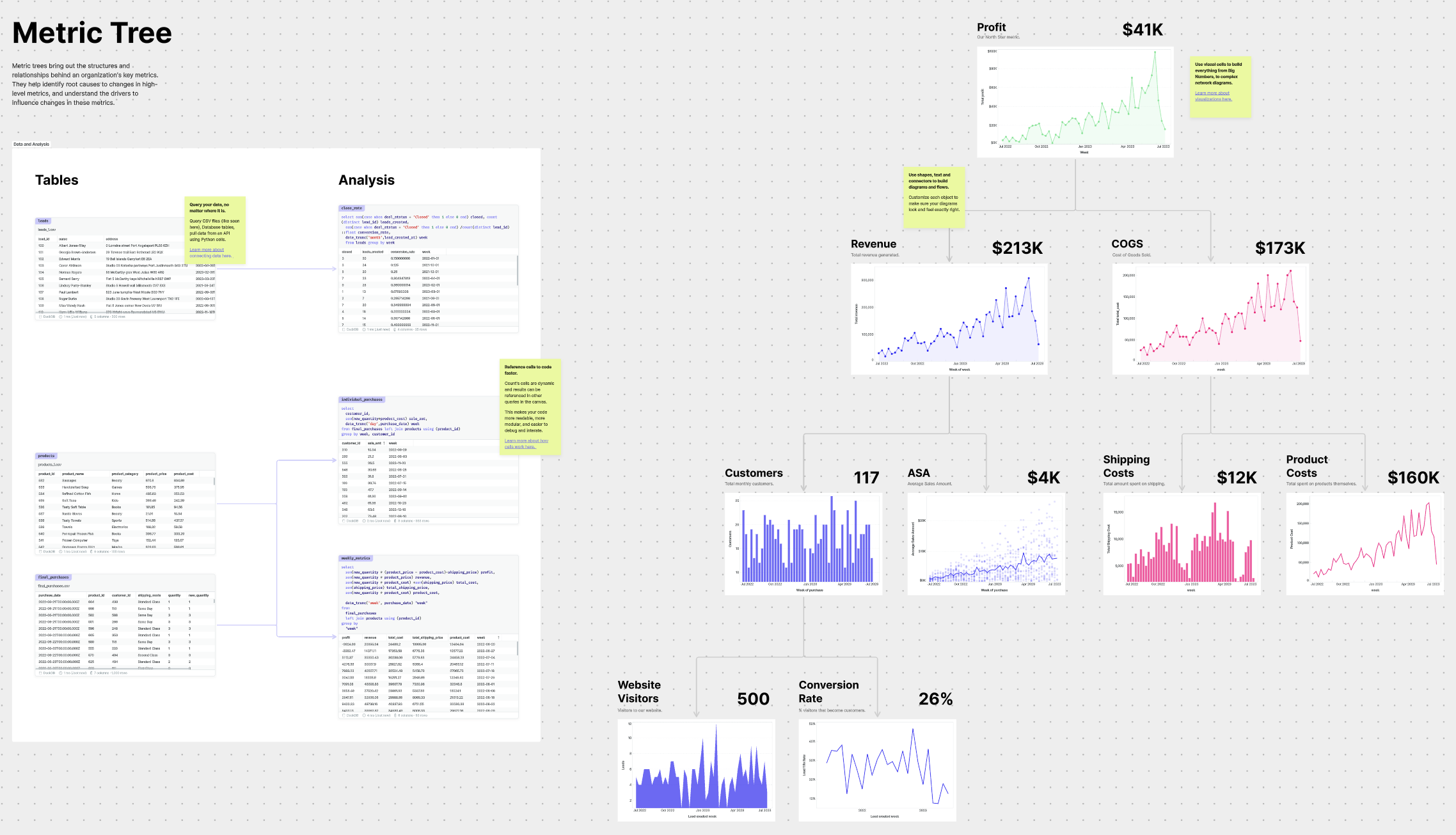
1. The canvas puts data in a business context
Let’s say you are trying to optimize your product’s onboarding funnel and as a first step you want to see the conversion rates at each stage. You might have a Miro of FigJam board with each step of your app laid out, and separately you might have a dashboard with the conversion rates in a chart. And maybe you also have some qualitative feedback from user tests in another tool.
In order to do anything meaningful to your onboarding process, you’ll need to blend the information from these three separate places.
However, with the canvas, data can be presented in any layout or format, including as an onboarding funnel. As shown in the example below, an onboarding funnel can be analyzed in the context of the product experience you are trying to improve.
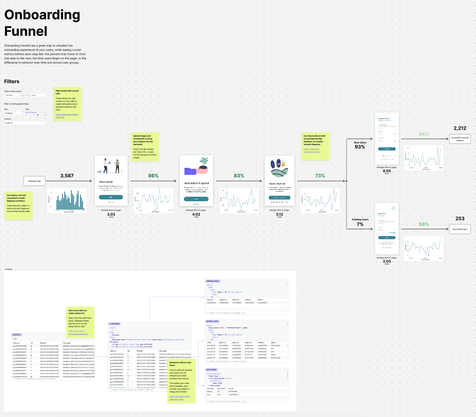
Presenting data in this way:
- allows you to focus on solving the problem at hand
- lets you identify patterns quickly
2. No black boxes - always see the number and how it was built
The bigger the decision your organization needs to make, the more you need to trust the numbers that you’re seeing. Dashboards lack any way to see how the charts were actually built. What assumptions did the analyst make? Were things filtered out that should have been included? Which time frames are we looking at, etc.
Unlike BI tools, the canvas has all the tools analysts need to do their analysis, not just present outputs.
This means when you’re reviewing insights or findings, you can look to the side and see the exact code that leads to that output, broken down into easy-to-read cells, with the explanation.
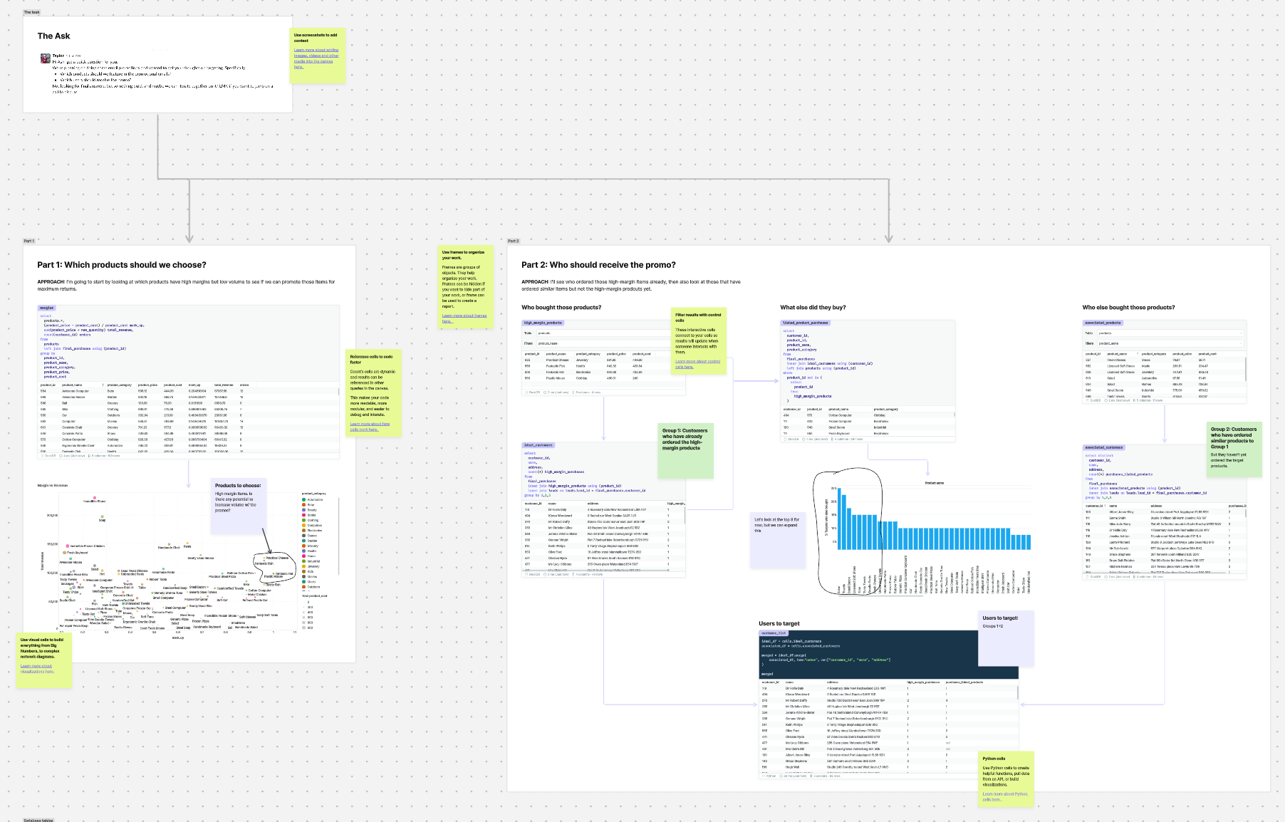
With your data and results side-by-side you can:
- quickly iterate an analysis (e.g. “What if we exclude this product?”)
- interrogate the analysis to check for assumptions or data quality issues
3. Built for change
Dashboards are built to be finished products. Once they are deployed, it's hard to modify them beyond adding a filter here or there. And yet, the business and the analytical demands change constantly.
Canvases are built to be living documents, not relics. When you decide on a new set of KPIs every quarter, instead of starting from scratch, you can tweak the existing canvas.
This move to a rapid iteration cycle means:
- more valuable data assets
- faster delivery (the data team spends less time perfecting a dashboard you don’t really need)
What you can expect
1. Reduced BI tool costs
With more data work being split between operational dashboards and iterative, explorative canvases, the demand for expensive BI editor and viewer licenses will decrease.
Count is free for any user not writing code, so you can share a canvas with the whole organization without worrying about sharing log-ins or paying for a seat you don’t really need.
“We cut our Tableau licences in half when we added Count. We made sure only the people that needed to build dashboards had license, and everyone else could use Count to explore data.” - Rosanna Sjöö, Head of Data at Scrive
2. Working more closely with the data team
The Canvas brings teams and people together around shared problems. Expect to work with your data team instead of slinging requests over a wall and hoping for the best.
"The time from question to answer has dramatically decreased because people can actually see the data. It's not a nebulous concept. It's a conversation." - Justin Freels, Head of Data at the Stable, a part of Accenture Song
3. Getting more confident with your company’s data
Whether you’re already a data expert or not, working in the Count canvas helps people outside the data team feel more comfortable using data themselves. This is not purely because of the cellular approach which makes SQL actually readable, but also because it can explain the data you have available to query.
When you integrate Count with your team’s data modelling tool, you can quickly import and visualize all of the logic that leads to a summarized table you have available to query. That way you actually know which columns to use and what to make of your analysis.
“It's helped us move quickly without hiring 20 data modelers. In the canvas 3 or 4 people at the same time are looking at a canvas and rapidly iterating through hypotheses, checking and visualizing the data." - Phillip van Blerk, Head of Data at Omnipresent
4. Data team efficiency
The cumulative effect of working through problems more easily, getting feedback from the business earlier and more often, and being able to work across the entire analytical workflow in one place is that the data team will be more efficient.
"We're saving hours and days of work, it's hard to even calculate it. When one of us gets stuck on a problem, we can jump in and help each other out faster than before. We have multiple analysts working on the same model at once now, each taking a different track. We can work with stakeholders to test prototypes so we aren't productionalizing something that won't be used. And we're doing all our testing and QA in the canvas before it goes to production and is impossible to find." - Chris Hloros, Head of Data at Trainual