How to Make Sure Your Analysis Actually Gets Used
How to keep the pirates at bay.

Beware of Pirates
One of the most universally demoralizing experiences is to see the results of your hard work go unseen, unappreciated, and unused. In the world of data that is something we experience all too often. Take the following hypothetical situation:
- Jim submits a request to the data team for a deep-dive analysis for a client presentation the following week.
- You and Jim spend all week working on the analysis, working closely to make sure he has the right visuals and feels confident presenting the findings.
- The day of the presentation arrives, and not a word from Jim. That’s odd.
- When you finally track him down he tells you he “didn’t end up using the charts after all.” “They just would’ve confused them,” he adds in a conciliatory tone.
- You are fuming. A whole week wasted. Another decision made without data there to back it up. Why did he even ask in the first place?
I like to call these requestors pirates because they steal my time. Unfortunately, there will always be pirates, but there are ways we can learn to avoid them, or at least cope with their existence. Here is a list of tips to make sure your analysis gets the credit it deserves, assembled from my own experience, academic research, and industry best practices.
1. Ditch the Data Request Forms
Most data teams have a request portal that they use to triage and assign data requests that come from the business. These portals are designed to make it easier for the business and data teams to work together; business users type out exactly what they want, and the data team just makes it happen.
Unfortunately, as we saw from Jim, it’s not that simple. Many business users come to the data team with a chart already in mind, including what the numbers on that chart should show.
At this point, we’re already doomed. If the data doesn’t match the story the requestor wants or is a bit nuanced then they’ll never use this analysis. We need to know the problem they’re trying to solve.
As data professionals, we know the data and the statistical methods better than anyone and can advise on the best approach to using the data to answer the question at hand. The business context in partnership with our data expertise can combine to create analysis far more impactful than what we could produce individually.
In short, we must be consultants, not hired hands.
2. Numbers Never Walk Alone
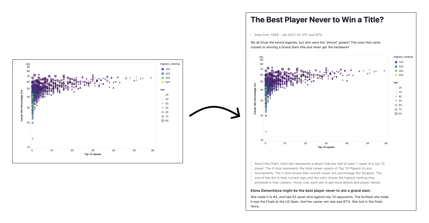
Often we’re expected to send over a single chart or dashboard as a completed request. These are nearly impossible for the business user to interpret without a 1:1 explanation.
We’ve been told that data can speak for itself; that a well-crafted chart can communicate all its nuances on its own. This is simply not true. A chart alone cannot possibly convey everything, and that kind of thinking inhibits our ability to influence the business with our work.

When sharing any analysis, I try to always include the following information:
- time period of data
- date of analysis
- author
- TL;DR: summary of context and insights
- explanation of how to read the chart
- how you did the analysis (not the code, but the layman’s explanation)
- limitations and next steps
This contextual information may seem like a headache, but it makes a huge difference. We haven’t just sent a chart, which, in isolation, can carry the unhelpful subtext ‘figure it out.’ We’ve sent them an analysis with everything they need to turn that chart into an insight, a small gesture that doesn’t go unnoticed.
Breaking the habit of sending charts out on their own gives them a chance to be understood, and ultimately, used.
3. Make it an Experience
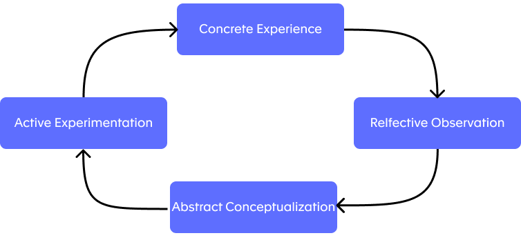
Surrounding your chart with context and explanation ensures the reader has everything they need to learn something from our analysis. But we learn best through experiences[1].
So to really make sense of your analysis, your users will need to poke and prod it. Kolb’s Learning model suggests they’ll need to experiment with our analysis and take the time to reflect on its real-world implications before they can properly understand it. Let’s help them get there.

At a minimum, this involves setting up interactive elements to your analysis. Add filters and parameters that let the user start to interrogate the data. What if you had double the budget? Half it?
This question-answer flow lets the user trust the analysis and understand how it relates to their problem, ultimately giving them confidence to wield that analysis in the boardroom. This lack of confidence is the number one reason your chart doesn’t make it into that slide deck, so take care here.
4. Make it Presentation Ready
Unfortunately, we can’t expect someone to take the time to learn from the analysis in a presentation the way our business partner has (hopefully) done up to this point. This means we now need to create a summary chart that can reflect the key points of our analysis but in far less detail.
Ideally, this is done as the last step of your analysis, once you agreed upon the key insights and how best to compose them into a larger decision or problem to solve. Then you can make use of Data Visualisation best practice [2] to create engaging and informative visuals that won’t intimidate viewers without sacrificing the complexity of your analysis.
5. Long Live the Analysis
One part of this process that is severely neglected is the question of turning this analysis into scalable knowledge. How do you make sure the business question you’ve just answered is shared not just with Jim, or Jim’s team, but with the wider company? And not just this week, but that it can be used in 6 months when the same question comes up again. The answer is unequivocally not a dashboard, but something more nuanced.
AirBnB’s approach [3] has been to implement a Knowledge Feed which takes the type of detailed analysis we’ve just outlined, and publishes it for the whole company to find. The result is a collection of reports that are easily understood by all users but still have access to the raw code and notes for analysts to use as a starting point for future work. The key attributes are documented that give everyone confidence in what they’re seeing (when it was published, the limitations, etc.). And they’ve made this database of knowledge easily parsable so people can quickly find the analysis related to their questions before they’ve submitted their request to the data team.
Now you can make sure that your analysis lives beyond this single data request and can be used again and again.
D.I.Y. Time
The benefit of this kind of way of working is it’s easy to test. The next time a request comes through from one of your more friendly business users (avoid pirates), I suggest trying this method out. Instead of materializing the chart they requested, ask to meet with them to better understand what they hope to do with this chart. What decisions is it informing? Who is the audience?
And as you work together in this analysis, I suggest using a data notebook to document the required metadata and explain your work to your business partner. This gives you the flexibility to contextualize your analysis in-line with code, and visuals so you aren’t trying to hack together a Google Doc somewhere.
Once you’re both happy with the analysis and findings, then work on the final chart together, and see how different it looks to what the original request was. I’m willing to bet they’re entirely different.
Committing this analysis to shared knowledge requires a bit more forethought. There aren’t many natural places for these notebooks to go; Github isn’t user-friendly enough for non-developers, and options like DropBox or Google Docs aren’t technical enough to include the code that’s required.
If you forced me to recommend a tool, I’d have to say Count, but full disclosure, I did help build it. Count is a data notebook that’s aiming to make this kind of way of working the norm. You can create high-quality analytical reports, full of context, explanations, customized visuals all in one document giving your work the platform it needs to outlive the transient data request and become knowledge from which the whole company can benefit.
References
[1]Kolb, D. A. Experiential Learning: Experience as the Source of Learning and Development. New Jersey: Prentice-Hall; 1984.
[2]Mahoney, Michael. The Art and Science of Data Visualization. Towards Data Science; 2019.
[3] Sharma, C. & Overgooer, Jan. Scaling Knowledge at Airbnb. AirbnbEng; 2016.
