Finding data clarity at a fast-growing fintech
"When I first started you couldn’t trust anything. We had a mess of queries and Tableau dashboards that disagreed with one another."

Madhav Goswami didn’t set out to be a data guru, but talking to us from his home in the Pink City of Jaipur, it’s clear that’s where he’s ended up. After an education as a civil engineer, he dabbled in software development and market research before discovering that ‘data is the new oil’ and jumping into analytics. Flash forward six years and Madhav is the analytics lead at Fairmoney.io, a fintech startup focused on serving the almost 3 billion people who lack access to banks and credit today. Pretty important stuff. He recently sat with Count Chief Data Evangelist, Mico Yuk, to discuss his journey to data, the keys to building real self-service, and how Count helped him and Fairmoney deliver company-wide metrics for the first time.
From Chaos to Count
Madhav joined Fairmoney when the data team was just two or three people struggling to manage the deluge of ad-hoc data requests common at any fast-moving startup. It has since grown to 15, with a host of specialists like data engineers and BI analysts.
‘When I first started you couldn’t trust anything. We had a mess of queries and Tableau dashboards that disagreed with one another and badly needed to build our infrastructure and processes. 50% of my time was just fixing wrong numbers.’
Like many cutting-edge data thinkers, Madhav and the team turned to dbt to standardize their work and start producing more robust data pipelines to deliver high-quality, trusted data sets. And it worked! But they quickly became victims of their own success as the volume of requests grew and grew. Madhav knew it was getting out of control.
Replacing OKR dashboards with a metric tree
‘You get a request and the general analyst will just put a dashboard on it. Then business people come and look at the dashboard, don’t see exactly what they need, and make a never-ending series of small requests that blow the dashboard up into something unmanageable.’
‘Out of 50 dashboards, only a few are even useful. I wanted a tool that helped us build charts on raw data very quickly. I was initially looking for a pure drag-and-drop experience when I stumbled on Count. The amount of detail and flexibility in the canvas was exactly what we needed.’
One of the first things Madhav and the team did with Count was to replace their mess of dashboards with a metric tree. A metric tree starts with the highest level KPIs for executives, and then moves down one level and shows what drives those KPIs, and so on. Each level has a name, L0, L1, L2, etc... For any given metric like Revenue, there may be three main factors driving changes over time. In a metric tree, you arrange them like this:
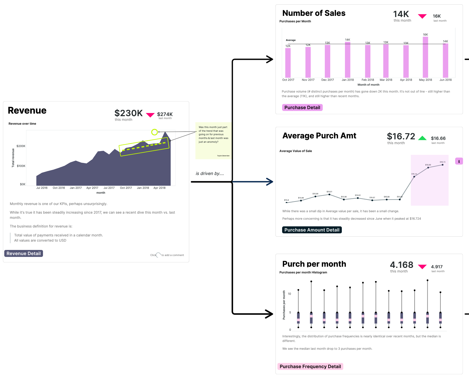
How to go from dashboards to a metric tree?
- First, identify all the metrics you need and get alignment on the definitions. This is crucial.
- Then understand the dependency curve between the metrics - basically the relationship or hierarchy between them. Map it all out.
- When you’re finished everyone will understand the business, understand leading indicators, etc.
Madhav’s metric tree contained so much crucial data it instantly became a key management tool at all levels of the organization.
‘Building out a metric tree in the canvas makes everything easier - answering ad hoc, developing new analytics. It’s foundational.’
In fact, its impact has grown far beyond management - it’s enabled them to start to tackle the holy grail of every data team… true self-service.
The 3 principles of real self-service
When it comes to self-service, Madhav is a big believer in the Pareto principle: 80 percent of the requests that come to the data team only deliver 20% of the total value - these should be moved to self-service. Hence, the data team focuses on the most important things. But how? That’s where Madhav’s 3 principles of self-service and the metric tree come into play.
- The data must be easy to understand. If it requires too much thinking or research to make sense of, it won’t work.
- You need great tools to manipulate and visualize the data - and that includes embracing dumping the raw data to excel when needed.
- Self-service can’t happen without the ability to corroborate your analysis vs the source of truth for your metrics.
Count helps with all 3. Replacing the OKR dashboards with the metric tree provided Fairmoney’s source of truth. Anyone can easily check their work regardless of their data or tool. ‘OKRs are for executives and don’t have the level of detail or context that the rest of the company requires to understand and validate the data. The metric tree keeps everything in line. Everyone understands the ‘why’ thanks to the dependencies. Even executives can use it because it’s easy and it’s all in one place.’ Madhav just couldn’t build this with other data tools,
‘Without Count, you just can’t define all the metrics in one page and allow everyone to see the holistic picture.’
Now everyone at Fairmoney has a single place to validate their results and ensure their self-service data work is accurate, whether they’re writing SQL, working in Excel or Tableau, or using Count.
Managing growth while delivering the goods
Fairmoney has many tools in their data toolbox - they still use a lot of Tableau. But for quick ad-hoc requests or context-rich presentations, Count has found a home.
‘Count comes in during the last mile of analytics, where you have to provide deep context. The development cycle in Tableau is challenging - you’ll get good dashboards but to get good context - to tell good stories - you need to devote too many resources. It doesn’t justify itself for the last mile or ad hoc. The Count canvas allows you to think multi-dimensionally in a way you can’t in Tableau.’
As for what’s next for Madhav and team? They’re applying the 80/20 rule to rationalize their dbt data pipelines into an ‘Integrated data model,’ which simplifies things and makes it easier to scale and adapt. With 7x year-over-year growth, Fairmoney’s data practice must keep evolving. By combing smart foundational principles like the metric tree and integrated data model with innovative technology like Count, Madhav’s team is more than up to the task.