Data Literacy hack: Creating psychological safe zones
In this article, I am going to walk through a playbook for how to host a robust and healthy data conversation in your organization, and create something called a ‘Psychological Safe Zone’.

Having real data conversations within your organization instead of tossing charts over the wall is the first step toward realizing the full potential of analytics. As the leader of a consultancy focused on data, being able to effectively communicate and challenge my clients with data has been an essential skill I have had to develop. Increasingly, it is also something I have been teaching my clients how to do so they can continue these conversations themselves to better understand and derive value from their data.
In this article, I am going to walk through a playbook for how to host a robust and healthy data conversation in your organization, and create something called a ‘Psychological Safe Zone’.
Why
It will not be a surprise to you that most of the problems in data analytics are not actually technical problems, they are people problems. My first 10 years sitting in front of my computer writing code did not prepare me for my first stint as a manager. Thankfully my parents were both in service, law enforcement, and nursing so I was surrounded by people who truly knew what great teamwork was and how important that is to success. I owe them a lot!
When I eventually found myself as a tech leader it became pretty apparent that building bridges into the wider organization and communicating well was going to be essential. Initially, this task felt pretty daunting. The gap in knowledge and terminology just felt too vast and I thought it would just take too much time to teach people. So often I just did not do it. I was never short of an excuse in my own mind to justify silence but the results and my career suffered.
Many painful years later I have learned that building bridges between teams is one of the most valuable skills I have. Without a common language and mutual respect within and between different teams work becomes frustrating and sub-optimal. Work does not get used, only sub-optimal solutions are found and toxic levels rise. Finding effective ways to communicate despite the knowledge and technical skill gaps is essential.
This is where the concept of creating Psychological Safe Zones comes in…
What is a Psychological Safe Zone
A Psychological Safe Zone (PSZ) sounds like something out of a therapy session but it is actually something you have probably already experienced in your career without knowing it.
Put simply, a PSZ is a place where employees feel accepted and can show weakness or failure without retribution. It is an environment where people feel able to ask for help, share suggestions informally or challenge the status quo without fear of negative social consequences.
You can imagine the power of this kind of culture when it comes to the challenges of collaborating amongst teams with different levels of technical ability. The team members with a limited tech background become fearful to participate. They can feel intimidated or are just too embarrassed to ask questions in these situations. At its worst, this kind of fear-driven culture slows down progress and leads to suboptimal outcomes, or worse, big mistakes because no one spoke out.
PSZ sets a cultural context where these kinds of “unspoken” mistakes can be avoided.
“Employees [in a PSZ] are more likely to innovate quickly, unlock the benefits of diversity, and adapt well to change” - McKinsey
In short, this is how everyone does their best work. It is a way of working where different strengths are celebrated, everyone feels valued and collaboration happens naturally.
A PSZ for Data Analytics
Imagine inviting a football player, baseball player, basketball player, soccer player, and ping pong player into a room to make a plan to win the championship in a yet-to-be-decided sporting contest. This is the best analogy for what happens in a Data Analytics project. Almost no other endeavor involves assembling teams with wide and differing knowledge sets and subject matter expertise.
The most common scenario I have seen involves three distinct roles: the project manager, the data analyst, and the executive. On day 1 several invisible walls exist within the team:
- The project manager is the subject matter expert but will be shy about their lack of tech expertise and while they will admit it up front they will not want to put this on display in the day-to-day conversations.
- The data analyst will be shy about their lack of even a basic understanding of the business domain (usually because they are new to the company).
- The executive will be shy about both however they will be the most confident in language and will have unique and nuanced understandings of both technology and the business domain.
To ensure project success, the inclination will be for everybody to stick to what they do best. To tie this idea back to our sports analogy, the football player should do all the tackling, the baseball player should do all the throwing and the ping pong player maybe should just stick to keeping score.
Meetings in this paradigm are spent playing language games and struggling to communicate. Each team member uses the language of their sport and does not know enough about the other sports to ask the right questions, understand the answers, and make fair assumptions about time or scope, or difficulty. Each one of the players is probably also worried about looking like a fool in front of the other athletes. What does a ping pong player know about baseball anyway?

But our team has so much more potential than that! By systematically breaking down these invisible walls and creating a shared language within the team we can start to ask each other better questions, make better assumptions, understand each other and help each other.
We are aiming for the football player to throw and the ping pong player to tackle and the soccer player to pick up a paddle. Through the creation of a PSZ, we give each team member permission to experiment and fail and ultimately the opportunity to upskill.
Count as a platform opens up the possibility of creating Psychological Safe Zones unlike any other tool on the market. It enables the creation of a collaborative environment where teams can do data analytics together forming an ideal place for team members with different skill sets and subject matter expertise to interact, learn from each other, and grow both professionally and as a team.
In most of my teams, the project manager is writing SQL before too long. The data analyst adds definitions of business terms to a data catalog and curates metadata so that the subject matter expert can write even more SQL. The executive stakeholder is leaving comments and sticky notes inside the Canvas. The team spends less time talking about timelines and project statuses and more time talking about data; where to find more, how to fix it better, and how to show it more clearly.
7-Step Playbook for Creating PSZ in Canvas
In the rest of this article, I want to outline the core principles for how I use a Count canvas to structure my analytical projects and create a PSZ. As you can imagine each project and each team is different, usually meaning more or less emphasis on a particular principle, but all typically apply in some way.
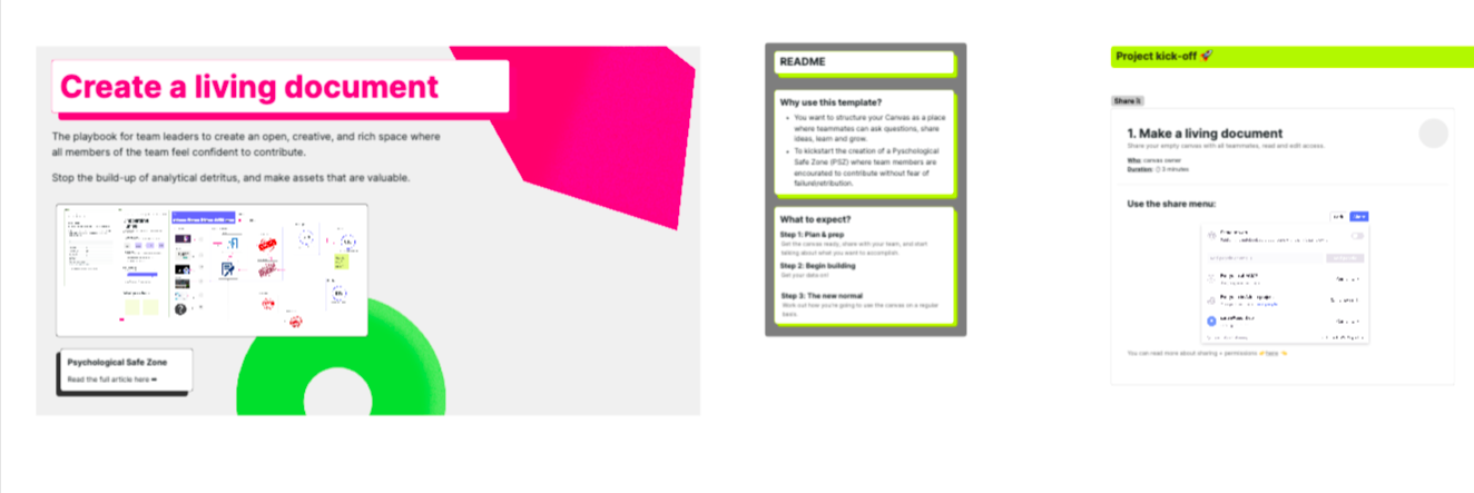
I have created a supporting example canvas that outlines each step in more detail and can be used as a template for your own projects. If you have a Count account you can actually import it directly into your own Count workspace using the template wizard.
The example is meant to be read from left to right and along the top, there is an illustration of roughly what your canvas might look like as you complete all the steps along the journey.
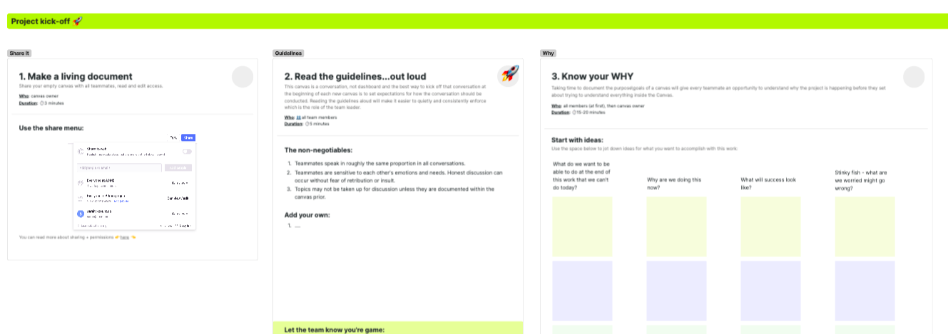
Step 1 - Make the canvas a living document
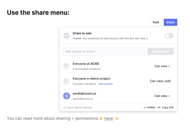
The first step in the playbook is to make the canvas live. Throw it over the wall, and release it to the entire project team with both read and write access. For most technical users this will be very uncomfortable. We are predisposed not to share work that is not done and/or perfect for fear of judgment and wasting others' time, but this is a crucial step. The project will never be done. Share it on Day 1, when it is empty so that the entire team can begin the conversation together.
Step 2 - Read the Guidelines Out Loud
This canvas is a conversation, not a dashboard, and the best way to kick off that conversation is to set expectations for how the conversation should be conducted. Reading the guidelines aloud will make it easier to quietly and consistently enforce which is the role of the team leader.
You can create your own, but for me, the non-negotiables are:
- Teammates speak roughly the same proportion in all conversations.
- Teammates are sensitive to each other's emotions and needs. An honest discussion can occur without fear of retribution or insult.
- Topics may not be taken up for discussion unless they are documented within the canvas prior.
- Every team member must make an edit to the Canvas every week.
In our example team above the project manager, data analyst and executive should all be speaking for roughly 9 minutes each in a 30-minute meeting. Absolute balance, you never have a meeting where someone just listens. The discipline of the project leader to enforce these guidelines with consistency will go a long way to establishing the PSZ within the team. When we start new projects as a leader I am listening intently in the first few meetings for any signal of honesty and vulnerability from one of the team members. Those moments should be highlighted until they become the norm.
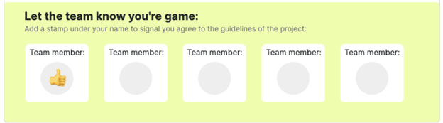
The template canvas contains an example for a Guidelines block and you can even ask each team member to add a stamp next to their name to signal their understanding of the guidelines.
Step 3 - Know your Why
We all know there are not enough hours in the day. When I have created dashboards in the past I usually skip the documentation part as I already understand my why and the context for what I am doing. Since documentation traditionally lives separately from the main product it is a safe assumption that no one will find it and read it anyway.
With Count, we have the opportunity for documentation to live inside and alongside the Analytics. Because people can now find it and read it we can provide the vital context needed for our teammates to understand the complexity inherent in our project. I call this documenting “Why” and it’s important it’s done as a collaborative team exercise so that everyone will have a stake in keeping this documentation fresh and useful.
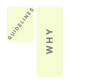
Count has several templates for helping you gather requirements and document project scopes examples of a Why pane. Once you’ve added your “Why”, blocking the shape of your canvas will probably look a bit like this:
Step 4 - Start Building!
Do your thing! This is where you can do all sorts of things with the canvas. The key is every step is transparent and shared and discussed amongst the team.
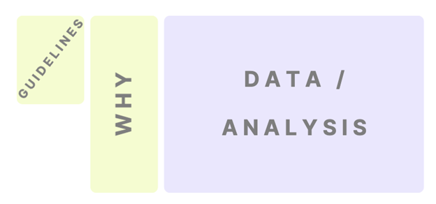
At this point our Canvas should look like this:
Step 5 - Add an Agenda Block
Once the conversation gets lively you will start to have more and more agenda items and it becomes natural to track these inside the Canvas.
One of the most common problems for data analysis meetings is the conversation will be steered down rabbit holes based on one team member's nuanced understanding of an edge case. Subject matter experts will take the conversation deep into domain logic; data analysts will steer into technical weeds. Remember, the team has a wide and varying understanding of the domain, data, and tools\technologies and very few people in the meeting want to remind the room of this fact.
To keep the conversation safe for all levels of understanding, all agenda items should be declared upfront via comments\annotations within the Canvas or in a dedicated Agenda block. Users should enter comments, create sticky notes, and add stamps. This will help the platform's adoption and give team members transparency and context for what will be discussed before any team meetings.
The pre-meetings we see become so common in large companies are replaced with team members logging into the canvas 20 minutes before the meeting to browse around and get comfortable with the content so they can contribute within the larger group. Count allows users to add comments and callouts to each object in the canvas to make it easy to highlight questions upfront.
We want to avoid at-all-costs meetings where teammates show up and opine on the project without ever having spent time in the Canvas.
Step 6 - Add a Metadata Block
When your subject matter experts start creating their own charts or writing SQL queries (and soon python snippets), then your data analysts will start to find they can add the most value by spending their time collecting, creating, and curating metadata.
The ability to reference metadata within conversations about data, analytics, and problem-solving, in general, is invaluable. Being able to bring up concrete documentation "about the data" helps everybody stay aligned and start speaking the same language.
Semantic layers are popular again for good reason - terminology discrepancies continue to ruin data analytics projects every day. I work mostly in financial domains where one man’s assets are another man’s liabilities. If I had a dollar for every meeting where data analysts confused themselves on the nuances of financial terminology I wouldn’t need to be writing this article.
The ability to reference a data dictionary alongside the canvas in every conversation is a game changer.
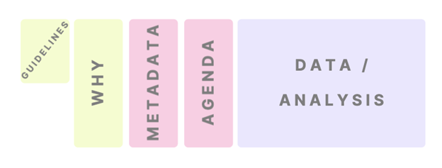
By now your canvas will broadly be structured like this:
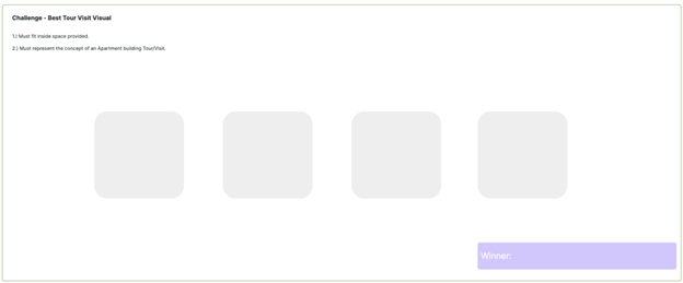
Step 7 - Add a Challenge Block
Challenges are used within the team to learn and practice how to contribute to Count dashboards. A challenge can be a contest. Who can find the best image to represent an idea? Who can write the best SQL query to summarize data? Who can create the coolest chart?
The project manager, data analyst, and executive should all compete to come up with the best visual to represent a particular metric. Instead of talking about it, they should do it. May the best chart win.
The flexibility of the canvas allows for many types of challenges.
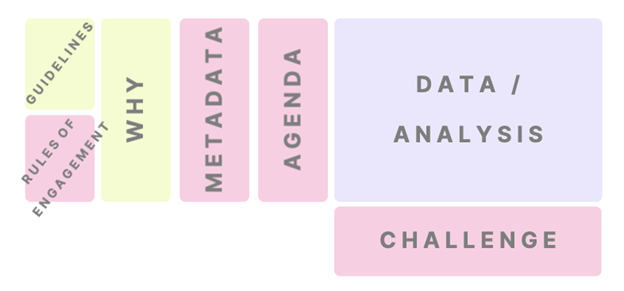
When using the full Playbook your Canvas will look something like this:
A Psychological Safe Zone will emerge because the leader is consistently enforcing a few simple guidelines that create space for team members to experiment and grow. Transparency and context will open the door for team members to experience guided discovery and learn at their own pace and on their own time.
The canvas will be a one-stop shop for your team members to have a conversation, through which you will begin to create a shared language that will raise the quality of all future conversations. This is the feedback loop that will enable your firm to realize the full potential of data analytics.
About the Author
Zac consults via salt.io and is obsessed with data discovery and curating metadata with an open-source set of technologies bundled at foodtruck.ai. The Psychological Safe Zone concept is a core part of the Leader193 curriculum.