Dashboards are Dead
Dashboards have been the primary weapon of choice for distributing data over the last few decades, but they aren’t the end of the story. To increasingly democratize access to data we need to think again, and the answer may be closer than you think!

Hello Dashboard, my old friend
When I started my career, I was working in a large tech manufacturing company. The company had just purchased its first dashboarding tool and our team was responsible for the exciting transition from tired spreadsheets and SSRS reports to shiny new dashboards.
The jump from spreadsheet to dashboard was a significant leap forward in analytical maturity for us. Dashboards’ thoughtful design and interactivity dramatically reduced the ‘cost of admission’ to data. Suddenly, you would walk around the office and see employees from any role and background fiddling with dashboards. This is a data lover's paradise, right?
Not quite. We soon found that dashboards brought with them a new set of problems:
You get a dashboard, you get a dashboard, you get a dashboard!
Suddenly, dashboards were everywhere. The engineer wants some data for an ad-hoc analysis? Here’s a dashboard. The VP has a presentation next week and wants some charts? She gets a dashboard. And no, they never looked at them again. The one-size-fits-all approach was draining our team’s time, resources, and motivation. It is a uniquely demoralizing feeling watching yet another one of your dashboards get ditched faster than your Myspace account in 2008.
Death by 1,000 filters
After a dashboard had gone live, we were immediately flooded with requests for new views, filters, fields, pages, everything (remind me to tell you about the time I saw a 67-page dashboard… #haunting). It was clear that the dashboards were not answering everyone’s questions, which was either a failure of the dashboard design step or a failure in other tools to provide the answers people needed. What’s worse, is we found out that people were using all these filters to export the data to Excel and do their own thing with it anyway 🤦♀️.
Not my dashboard
As quickly as the dashboard hype arrived, it began to wane. People started disparaging dashboards as ‘wrong’, and blatantly ignoring them. Many saw them as a threat to their jobs and if they saw numbers they didn’t expect, chalked it up to ‘bad data’. We had a serious trust problem, and dashboards offered little opportunity to assuage their concerns. After all, we couldn’t send them our SQL queries that fed into them; they wouldn’t be able to read them, let alone understand the ridiculously complex schema it reflected. And we couldn’t send them raw data in the case that each team would create their own metric definitions. I may have understated it…we had a massive, festering, oozing trust problem.
Real example: What’s in a scary red dot?
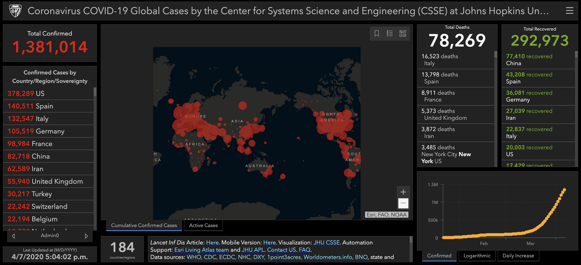
To demonstrate this further, let’s consider a data dashboard that’s been widely popular during the current Coronavirus crisis: the Johns Hopkins Coronavirus Dashboard.

The JHU dashboard is visually appealing; the red and black evoking a sense of severity and immediacy that this moment deserves. As our eyes span across the page, we’re confronted with numbers, dots of various sizes, and graphs almost always increasingly headed up and to the right. We are left with a sense that things are bad, and seem to be getting worse. This dashboard was built with the purpose of getting data out there in an accessible and engaging way. It may have even been designed to answer a few key questions like “how many new cases were the today in my country? my county?” And to be clear, this is so much better than if they had just posted a table or a download link.
But beyond those superficial findings, we cannot take action with this data. If we wanted to use this data for a specific purpose, we would be lacking the necessary context around these numbers to make them useful — and to trust them as our own (e.g. when did social distancing measures start in my country/county? How available are tests in my country?) And even if we somehow did manage to get the necessary context to trust these numbers, the dashboard itself lacks the power and flexibility to do the bespoke analysis we would need.
Much like in my experience at a certain unnamed company, this dashboard is succeeding in getting people to do something with data, but not necessarily something meaningful with data. At said unnamed company, we tried to solve this by adding more and more dashboards, then adding more and more filters to those dashboards, then killing those dashboards when they decidedly weren’t useful. This negative feedback loop contributed to a serious mistrust of data and inter-team schisms, many of which I believe are still around if passive-aggressive LinkedIn updates are to be believed.
Dashboards have done a huge amount for data empowerment (and my career!) but they are certainly not the optimal interface for data collaboration and reporting. Thankfully there’s a contender which you may already be using…
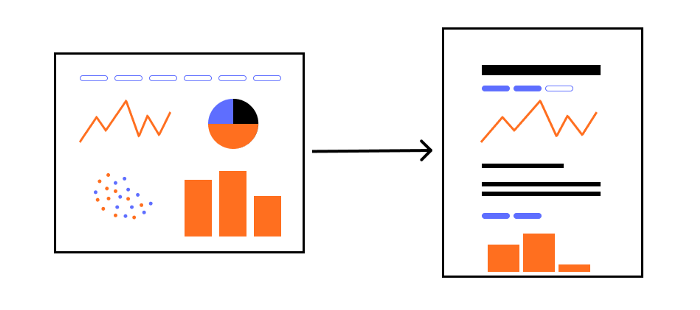
Data’s going portrait mode

Data notebooks, like Jupyter, have become very popular over the last few years in the data science field. The process-oriented nature has proven superior to traditional scripting for doing data analysis and data science. Not only is this beneficial for the analyst doing the work, but it also helps the boss/coworker/reluctant friend that has to use it.
Fundamentally, notebooks offer the opportunity:
- for everyone to trust the process (because they can literally see the code and the author’s commentary),
- to have the power and flexibility to answer any question (so long as the user knows the language in which the tool is written), and
- a way to collaborate on, present, and share these decisions with a wider audience.
I am certainly not the first one to want to apply the power and flexibility of notebooks to the data analysis/business intelligence realm. We’ve talked to a number of companies who are using notebooks in favor of dashboards. Some only use Jupyter notebooks for their reporting, others will cut and paste charts into text editors to achieve a similar effect. These are imperfect solutions, but a sign that companies are willing to move past highly crafted dashboards to realize the benefits of notebooks.
We just need a way to extend these principles beyond data science and enable the notebook to become as accessible as dashboards have been.
A notebook for the masses
At Count, we’re so convinced of the fundamental benefits of notebooks that we’ve built a data analysis platform around them. No dashboards here people!In order to use them beyond the walls of data science, we’ve had to craft our own version but the fundamental principles still apply, but with some added benefits:
Built for all levels of experience
- No need to teach everyone on your team Python or SQL since queries can be built by dragging and dropping, writing ‘notebook SQL’ (see below), or writing full SQL.
SQL:
SELECT count(Movie.movie_id), Genre.genre_name
FROM Movie
LEFT JOIN Genre on Movie.movie_id = Genre.movie_id
GROUP BY Genre.genre_name
Count:
count(Movie.movie_id), Genre.genre_name- Get quick visuals with a single click, so no complicated visualization packages or software.
- Auto-joining of tables and query outputs so no need to write complex joins or try to explain the schema
Collaboration-enabled
- Share notebooks with a teammate, your whole team, the entire company, or to anyone with a link.
- Add comments and call-outs to make it truly a shared document.
By embracing notebooks at the core, Count provides the power, transparency, and collaboration which teams need to not just give people numbers, but to give them the power to get the insights they need and share them with the rest of the company.
As we’ve been building Count we’ve been working with a number of organizations to see how notebooks change the way data is used amongst the team. Here’s what we’ve found:
- Analysts use notebooks instead of crazy SQL scripts to create a few base tables that other teams use. These notebooks are viewable (and interpretable) by anyone so no one dismisses the numbers on the basis of not knowing where they came from.
- The data team creates a handful of base reports. These reports are full of commentary to help guide readers on how to interpret the numbers and any considerations to take.
- Users then fork these notebooks or create their own to answer their ad-hoc questions. They share these notebooks with the data team so they can help guide them, then they present and share them with other parts of the business.
Since everything is consumable by everyone, and in a single place, the trust issues start to improve (or, in reality, just become about something else). They aren’t creating dashboards for people who won’t use them, or thousands of filters to accommodate every need since people have more power to create the reports they really need. The scenes they describe prove that the small shift from dashboard to notebook can have a dramatic impact on the way your team uses data.
If you want to learn more about how notebooks could help make your team more data-driven, drop us a line at hello@count.co, or you can read more here!
This is article one of our “a call for better analyst’s tooling” series. Other articles in the series include:
- Dashboards are dead — why dashboards are no longer enough.
- The Analytical Workflow is Broken — why notebooks are replacing the standard analytics toolset.
- Numbers are no longer enough— why we need more than charts to change the world.
- How to bring notebooks to your organization—change your organization's performance one data request at a time.
Resources
- Coronavirus COVID-19 Global Cases by the Center for Systems Science and Engineering (CSSE) at Johns Hopkins University (JHU) (2020), John’s Hopkins University
