A data notebook buyer's guide

So you’ve decided you’re ready to take the plunge into a data notebook. It can be easy to get lost in the data-notebook hype and ever-increasing options available to you, making it difficult to choose what’s really best for you and your team.
In this guide, I’ll walk through the features that define the category of data notebooks, and the common problems you can expect notebooks to solve. Then we’ll walk through the differences between popular notebook solutions, especially highlighting why we at Count have gone with a very different approach.
What notebooks have in common
Modern data notebooks all have the same essential elements:
- Code-first interface (in contrast to drag-and-drop visualization tools)
- Cells that have code inputs and outputs
- Ability to see more than one cell at a time
- Cell types:
- SQL cells
- Python cells
- Visualization cells
- Filter cells
- Ability to reference other cells (even between SQL & Python)
- Ability to add text between cells for narration
Why teams adopt notebooks
Teams may choose to adopt a data notebook for a number of reasons, but by far the most common are:
- Improved analytical workflow: Analysts used to have to chop up their work across a SQL IDE, visualization tool, and back again, just to complete a simple request. Notebooks let you query, visualize, and explain code in one place, greatly saving individual analysts headaches and time.
- Data team collaboration: Traditional tools, and even older data notebooks, had no easy mechanism for working together around a bit of analysis. Modern data notebooks are all web-based, and collaborative by design, meaning you can get some advice from other data team members easier than ever before.
Where most notebooks fall short
Despite the points above, notebooks won’t solve all your problems. Here’s where they tend fall short:
- Not good for complex problem-solving. The more complex the problem you’re trying to solve, the more you will find yourself lost in your notebook. Where was that cell where I calculated weekly active users? No, the other one. Large notebooks require an immense cognitive load to remember where certain things are in your notebook and to navigate to them effectively.
- Even harder to work on a complex analysis together. For the same reasons as above, it is exponentially more difficult to communicate complex notebooks with someone else. Most of the time people scan a few cells then lose the trail and give up.
- They don’t encourage collaboration from anyone outside the data team. Most data notebooks have very technical interfaces (as they are very technical tools). However, this means anyone not used to working with SQL IDEs or code editors is going to be very intimidated by this design. Therefore, you shouldn’t expect notebooks to engage anyone outside the data team.
- Very limited storytelling. Notebooks can easily turn into interactive reports (sometimes called data apps). These are long-form dashboards with slightly more context. Most stakeholders still prefer the visual spacing of dashboards when given the option over long-form reports unless for very niche contexts.
Count: A data notebook remixed
In 2019 we had a typical data notebook. It was a long-form document with SQL, filter, and visualization cells one on top of the other. Data teams used the notebook to explore data and create interactive data stories. However, we ran into the shortcomings listed above. So we tried something different.
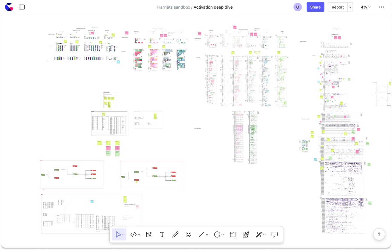
The Count canvas has all of the components of a notebook (cells, visuals, filters, etc.) but in the context of an infinite whiteboard (think: Miro, FigJam).
What’s the difference?
By putting our notebook in an infinite whiteboard, a few key things changed:
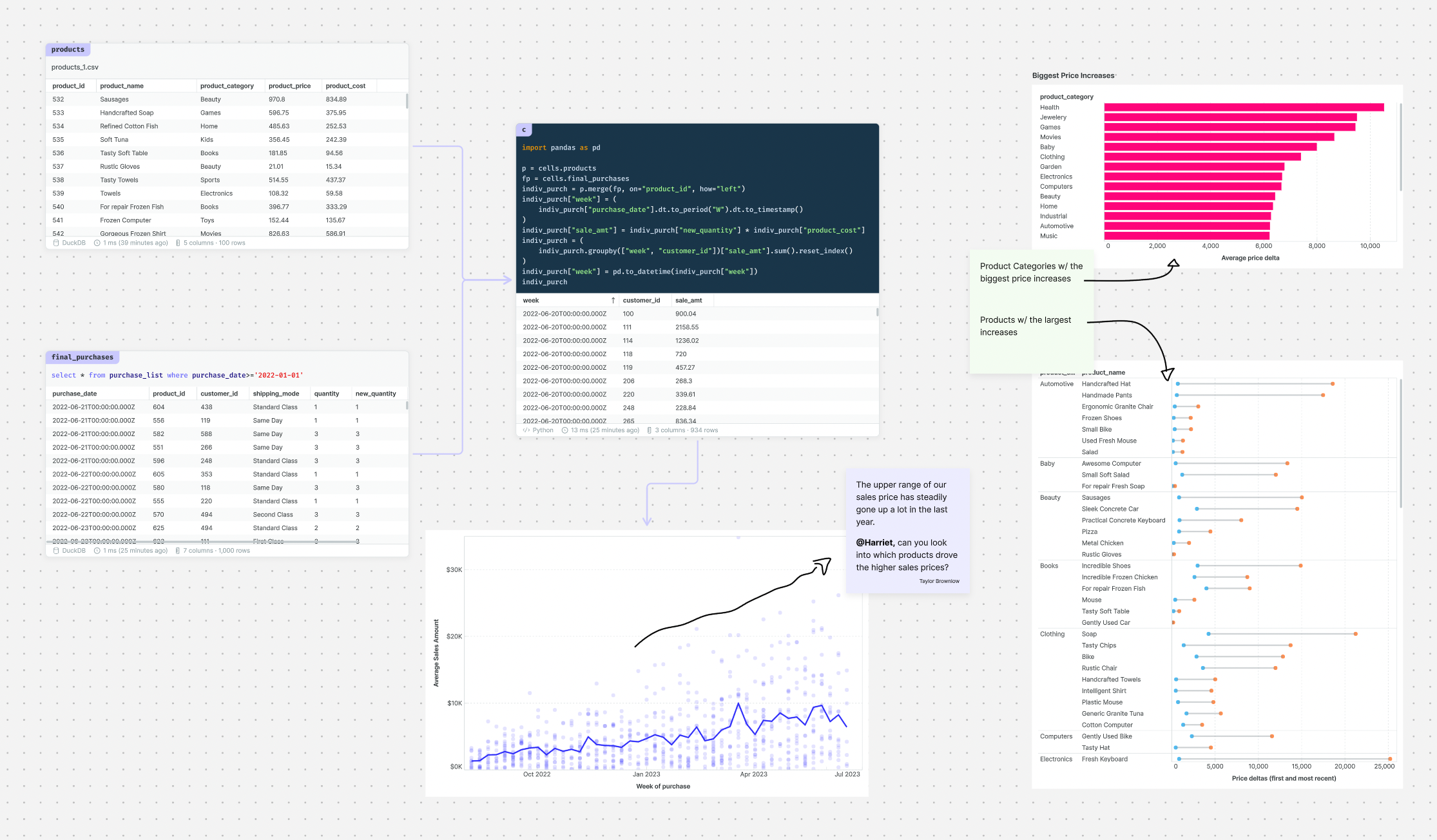
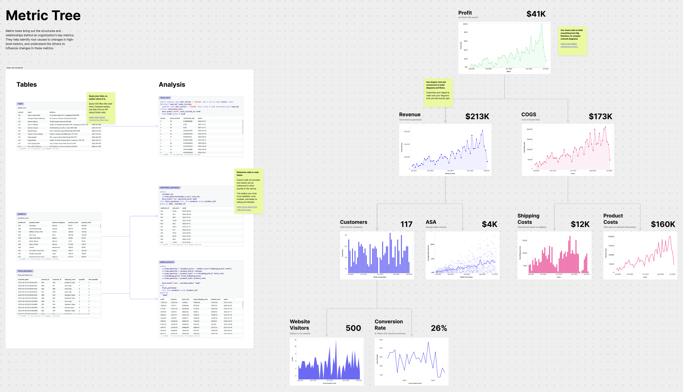
[1] Space to solve problems. Notebooks worked when an analysis required a handful of cells that flowed fairly linearly. With the canvas, you can go far beyond that. Something as simple as comparing 2 versions of a query side-by-side becomes trivial in the context of an infinite whiteboard.
The value of the spatial layout grows with the complexity of the problem. Even in the most gnarly pieces of analysis (like the one below) it's possible to find the right patterns.
[2] Collaborate with more than just the data team. Stakeholders are already used to Miro and Figjam so the canvas feels far more familiar and welcoming to them than a traditional notebook interface. And since your cells are laid out spatially (not linearly), with sticky notes, your work is surprisingly easy to follow, even for less technical users.
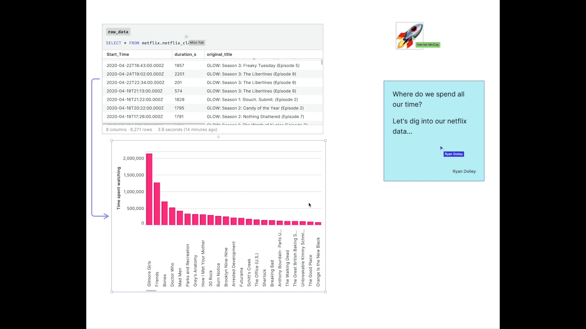
[3] Tell better stories. In the canvas, you can build any kind of data story you want. You no longer have to display funnels in grids, but you can actually build out your funnel and add live data between each step. You have the space to tell stories in their proper context.
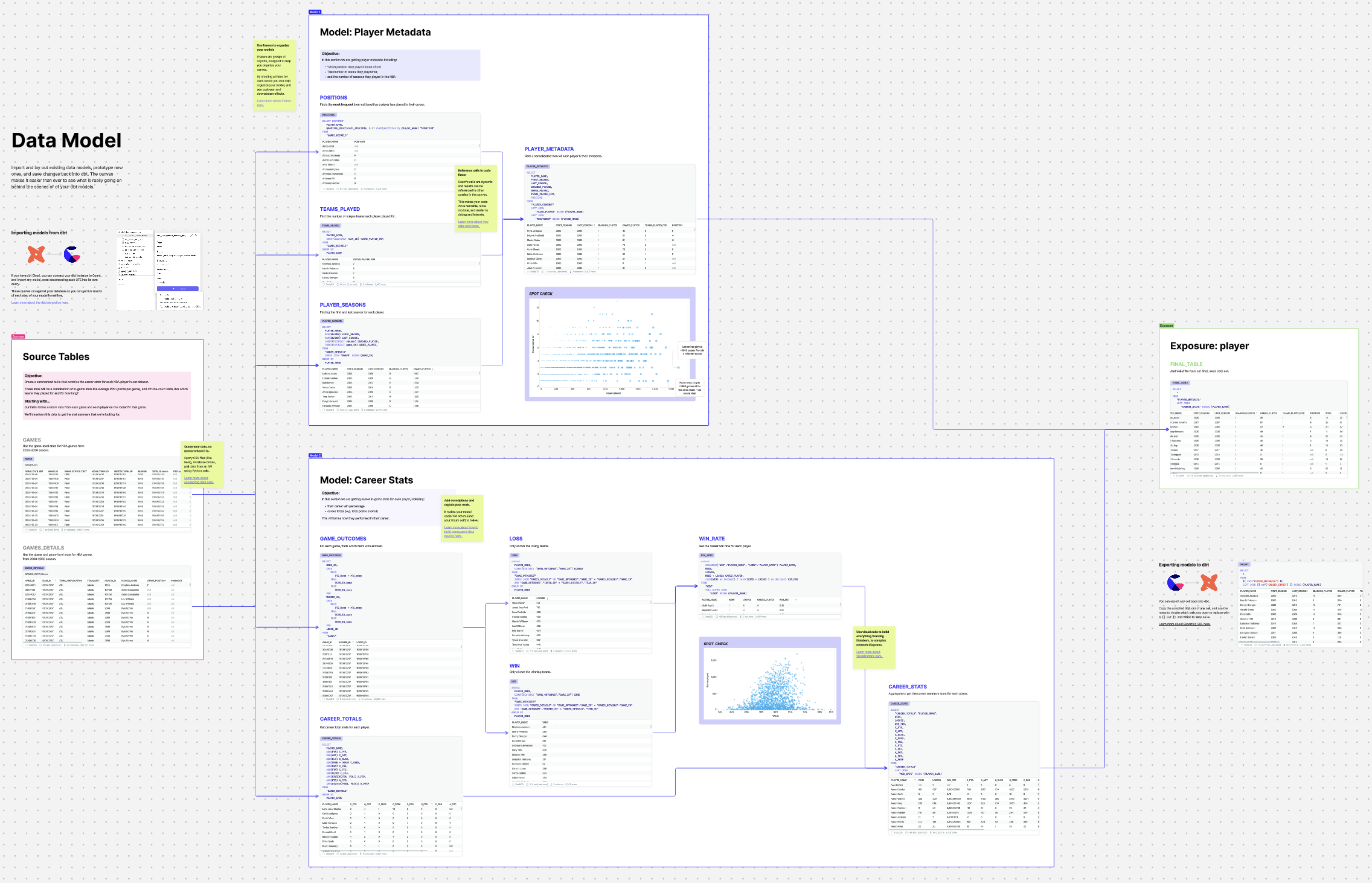
[4] An unexpected use case: data modeling. In the years since releasing the canvas, we’ve been surprised to see the number of people using it for data modeling. The spatial layout pairs well with the DAG approach to data models, and in the canvas, it becomes easier than ever to work on models with stakeholders and fellow analytics engineers.
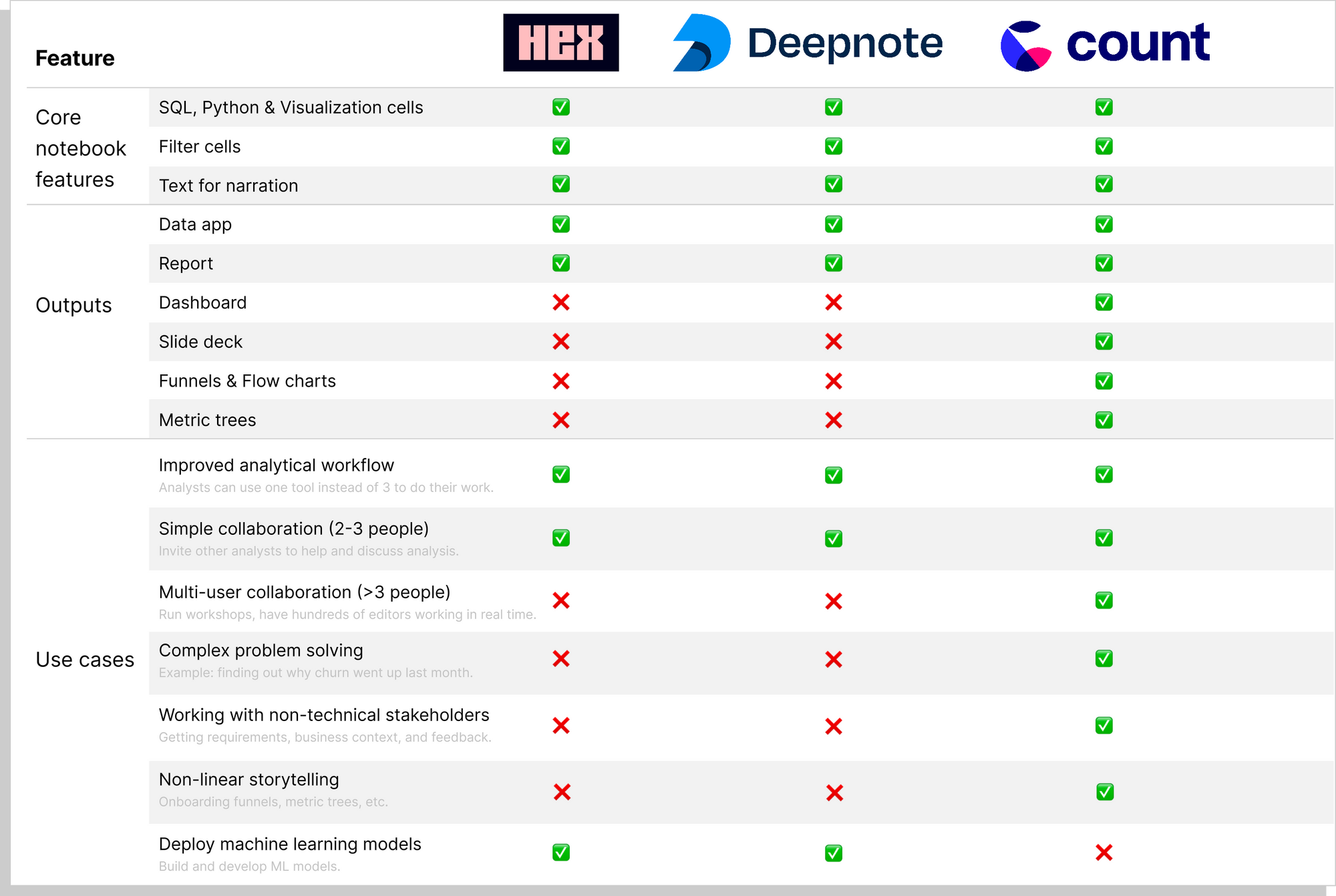
Notebook comparison
Below is a summary of the features offered, and use cases supported by Hex, Deepnote, and Count.